


In this era, billions of people prefer using their mobile phones to go on the world wide web rather than a PC. If we walk back into history, on 21st of April 2015 was the official date to mark what many internet geeks calling it as “Mobilegeddon.” A mobile algorithm update that is primarily concentrated on giving mobile-friendly sites a boost in smartphone search results. Well, this might sound like old news for now, but this is one of the significant milestones that opened the mobile era. If you are a WooCommerce store owner, optimizing your store for a more mobile-friendly one to cater to a growing mobile audience is crucial.
I will voice my opinion on why you have to optimize your eCommerce store for a mobile device. As per Oberlo, around 6.8 billion people are expected to use smartphones, which indicates an annual growth of 4.2%.
“Mobile is becoming not only the new digital hub but also the bridge to the physical world. That’s why mobile will affect more than just your digital operations — it will transform your entire business.”
– Thomas Husson, Vice President and Principal Analyst at Forrester Research
WooCommerce sites that are mobile-friendly tend to get a more favorable search engine ranking compared to the sites that are not. Optimizing your store can provide the following:
- A positive user experience for customers.
- Encouraging them to return or stay longer.
- Considering the extensive mobile traffic available today.
The answer is simple: optimizing your WooCommerce store for a mobile device can positively impact your sales, increase your revenue, and reduce your bounce rate.
Is Your Site Mobile-Friendly?

Mobile-Friendly Test by Google has made this easy, and you use this tool to check on several things, from visitor’s user experience to how your site looks to your mobile visitors.
They give definitive conclusions on whether your WooCommerce site is mobile-friendly or if they are not.
How Can You Determine if Your Theme Is Mobile-Friendly?
When it comes to WordPress and WooCommerce, if the theme you opt for is responsive, this signifies that the layout will be adaptable across all devices. You can analyze and gradually make adjustments to optimize your website using Google’s mobile-friendly test tool.
So What if Your Site Is Not Mobile-Friendly?
If “Mobile-Friendly Test” pops out the message that your site is not mobile-friendly, you don’t need to panic, we got you covered. Well, I am going to help you get started on how you can make your site mobile ready.
Steps to Enhance Your WooCommerce Mobile Experience.
Adopt a Mobile-Friendly Theme.

Using a mobile-friendly WordPress theme is the first step to optimizing your WooCommerce mobile experience. Some might have done it already, but this is the fundamental step that you should start now without hesitating.
Mobile-friendly themes have two key features, they use a responsive web design, and themes are lightweight. So having a responsive site lets your pages adapt dynamically based on the size of the user’s screen. Perks, you don’t need to work on creating a bespoke mobile site apart from the current desktop site, as it already suffices.
Being lightweight, mobile-friendly themes are usually handy as it is of smaller file size. This makes your site load faster as the themes generally make lesser HTTP requests.
Testing the responsiveness of your theme from time to time is essential, you can make use of the Responsive Website Design Testing Tool. So, all you got to do is enter a URL and select a device, then you can view how your website appears to a specific user.
So whether you are going to experiment with which theme suits your site, make sure to test the new configuration comprehensively from the beginning stage. So if the theme works out for your site, run the Google Mobile-Friendly Test to ensure that no new problems have been introduced.
Lazy Load Images
Well, images have always been a critical component of any WooCommerce site. It’s a well-known fact that customers primarily focus on product images, as this aids them in visualizing the product they are about to purchase. The theory is simple, “Higher the Resolution, Higher the Revenue.”
But at the same time, including higher-quality images can also be rather challenging, as they tend to have larger file sizes. So bigger file size correlates with a slower loading time. So want to make it quicker for a mobile visitor, you got to optimize your images. Compressing an image to reduce the file size is quite a common type of image optimization used.
Making it easy for your customer’s browser to load the site quicker and more efficiently.
Another way is using a lazy loading approach, where you could create a placeholder for images and then make the real images only load completely when required. With this, when the visitor scrolls down the page, the image most likely loads as they need to appear. So by going for lazy loading, there are certain perks like visitors do not require to use high bandwidth to view our pages, you can boost search engine ranking, and finally, giving an incredible user experience.
AMPs Is the Answer
Accelerated mobile pages or more commonly known as AMPs, is an open-source project created and headed by Google and Twitter. With a simple goal, which helps pages to load more quickly on mobile devices. AMPs is an ecosystem that optimizes mobile pages by managing HTML, rendering resources, and caching web pages. To enhance the efficiency and swiftness of the mobile pages, AMPs use a compact version of HTML. So the tags that work on a typical webpage are incompatible with AMPs.
AMPs require a simplified CSS version, so that will keep the page light. With this, images will load dynamically on scrolls down, and forms will not be supported. Google can cache most AMPs pages, but even publishers and other third-party websites can maintain them.
As per Google, Accelerated mobile pages that are functioned through their search engine consume only one-tenth of the data used by standard pages. Moreover, these pages generally load within a second, making them incredibly efficient for users who value speed and convenience.
Make Easy-To-Navigate Clean-Cut Pages.
Website navigation is a very integral aspect of a website. Giving an intuitive, clear, and easy-to-use main menu can be a game changer for the site’s prospects. For a mobile site, the menu’s structure has huge significance as there is quite a limited screen space to work with. I recommend keeping your WooCommerce store’s menu minimalistic so that user navigation is made easier and you find what your consumers are looking for with fewer clicks.
Another brilliant strategy is reducing the number of options at every menu level. However, including many options leads to a clutter of small text that is usually hard to read or clickable elements that are close to each other, resulting in chaos. Well, these shambles can make your eCommerce store much harder to use on a mobile device.
Too many options lead to a few things, difficulty navigating, confusion, and leaving the site. An extreme option for mobile sites is going for a “Hamburger menu.” Hamburger menus are usually minimalized until selected, and later on, it covers around ¾th or all of the screen, giving maximum space to display the menu items.
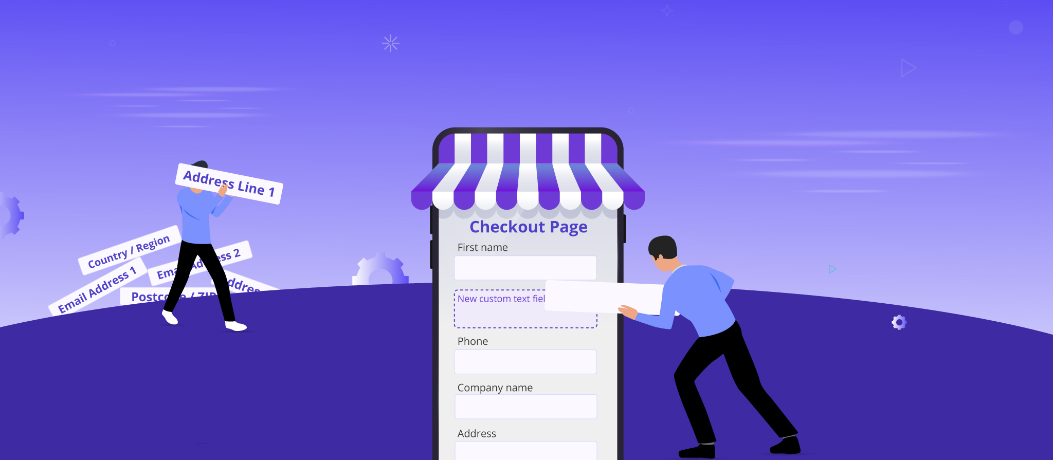
Streamline Your Checkout Pages.
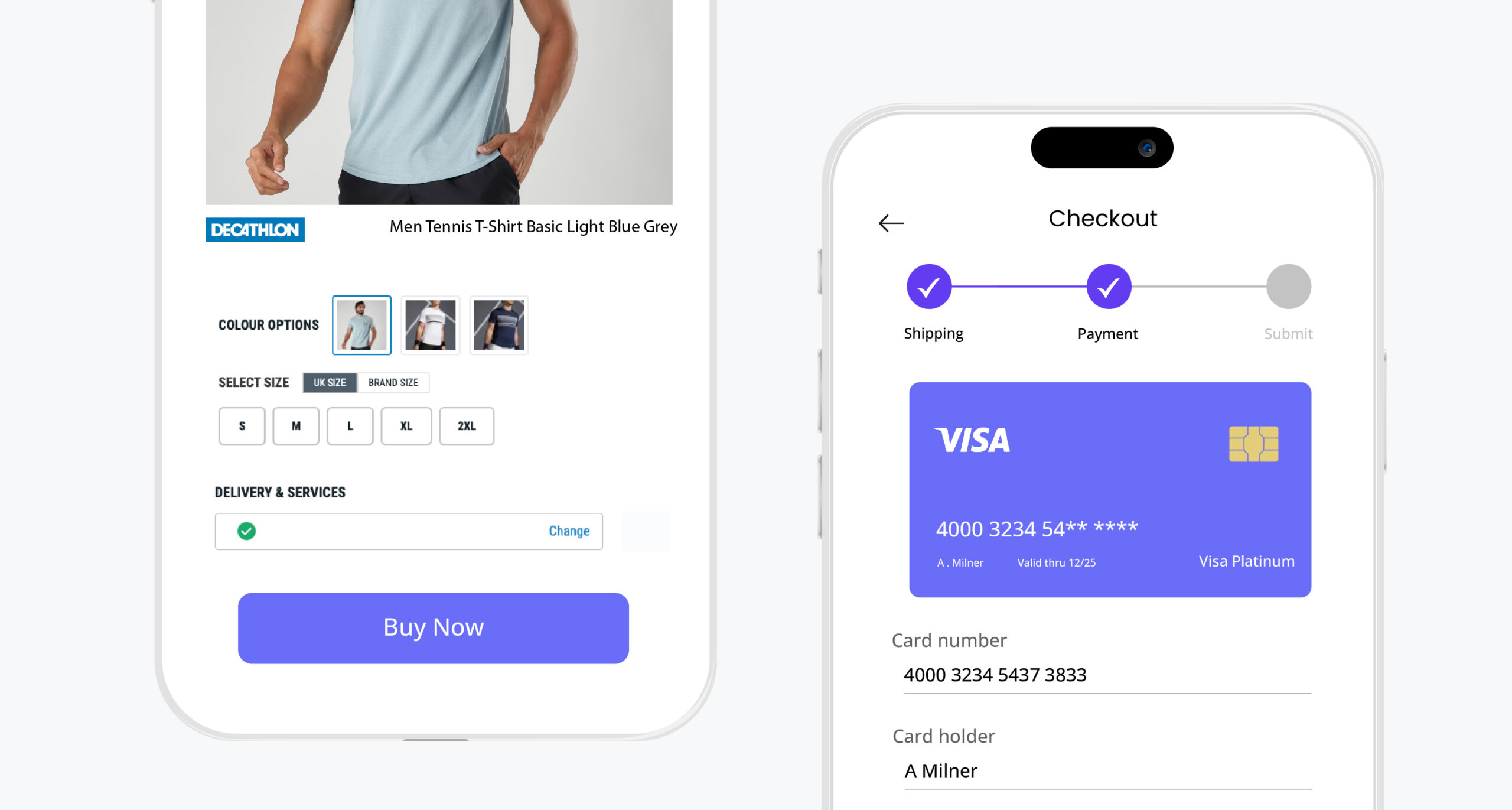
Giving a seamless and hassle-free checkout experience cannot be overlooked, no matter what device your visitors use. It is quite imperative that you take proactive steps to identify and remove any stumbling blocks that could deter a potential customer from completing their order. Now, this can be a simple process. Implementing a few adjustments can give your customers a smooth checkout to complete the purchase. Well, this can be done easily with Checkout Field Editor for WooCommerce from Themehigh. With this highly personalizable plugin, your can easily customize checkout fields and sections based on your store’s needs.
I always found setting up a whole account to make a purchase often tedious. The truth is customers are here to buy a thing as easily as possible rather than filling form after form just to make a simple purchase. Well, the good news here is it can be easily avoided by going to WooCommerce > Settings > Accounts & Privacy and checking “Allow customers to place orders without an account“. Another way to enhance your checkout flow is to let the customer edit their cart details on the final checkout page. So this is not possible if you are using a default WooCommerce configuration, what result here is that customers who want to make specific changes, like adding or removing products, must leave the checkout page. Which likely makes them abandon the cart.
Bringing this to a Close
Embracing the fact that consumers prefer to shop via mobile rather than a site, the better measures you can take to optimize your stores for mobile devices. With the major population having already evolved, using mobile to access the internet more than ever before, it’s high time you make your store a bit more mobile-friendly. This doesn’t mean you have to replace your desktop site and build one from scratch. Instead, take measures to tweak and adjust your WooCommerce store site a little so that they work on all kinds of screens. The outcomes of introducing inclusivity of introducing your site in every type of device can help you build a solid consumer base both via desktop and mobile.


 THANK YOU!