Now that you have learned about variable products and variation swatches let’s learn how to design the swatches to match your store’s theme.
This article can help you in:
-
Understanding how to set up swatch designs.
-
Setting up other swatch settings(Global Settings).
- Convert all the default swatches types to Label Swatches.
- Styles to display unavailable variation and out-of-stock variation.
- Ajax Variation Threshold
- Learning about the Lazy Loading feature.
Swatch Designs
For styling your swatches, there are four distinct ‘Swatch Designs’ available. By default, any attributes created will have the default design. Also as we discussed in the other article – How to create swatches using the Variation Swatches plugin?, that custom attributes will not be listed in that Product Attributes tab, they will also have the default design.
Note: Only the changes made in the default design will be reflected on the custom product attributes.
Step 1: Click on the Swatches Designs tab from the Variation Swatches setting page.
This will navigate to the tab where all 4 designs will be listed.
Step 2: Click on the edit button(pencil icon) on any of the designs(eg: Design 1) you want to customize.
A sidebar popup will appear from right to left of your screen, where you can style the swatch designs, by styling attribute’s icon size, color, shape, on hover styling, tooltip styling, etc.
Step 3: On the Common Attribute Styling tab you can set the ‘Design Name’, ‘Icon Height’(in px), ‘Icon Width’(n px), and ‘Icon Shape’(Round/Square) from the drop-down.
Backend View
Frontend View
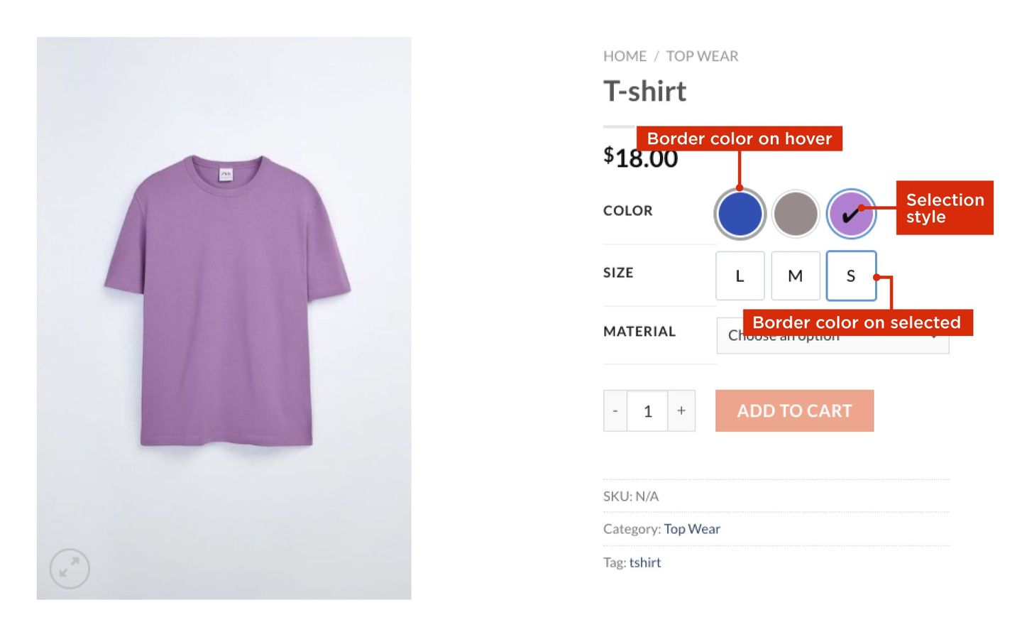
Step 4: Next on the Hover and Border Styling tab you can style the icon’s border color.
- Border Color- The default icon border color of the attribute terms displayed on your product page.
- Border Color On Hover- Icon border color while the cursor is hovering over the attribute term.
- Border Color On Selected- Icon border color when any of the attribute terms is selected.
- Selection Styles- From the dropdown menu select any of the styles you prefer (Border on Selection/ Checkmark with Border).
The selected attribute term can be styled to stand out from other options. These styles are only applicable for color and image swatches.
Backend View
Frontend View
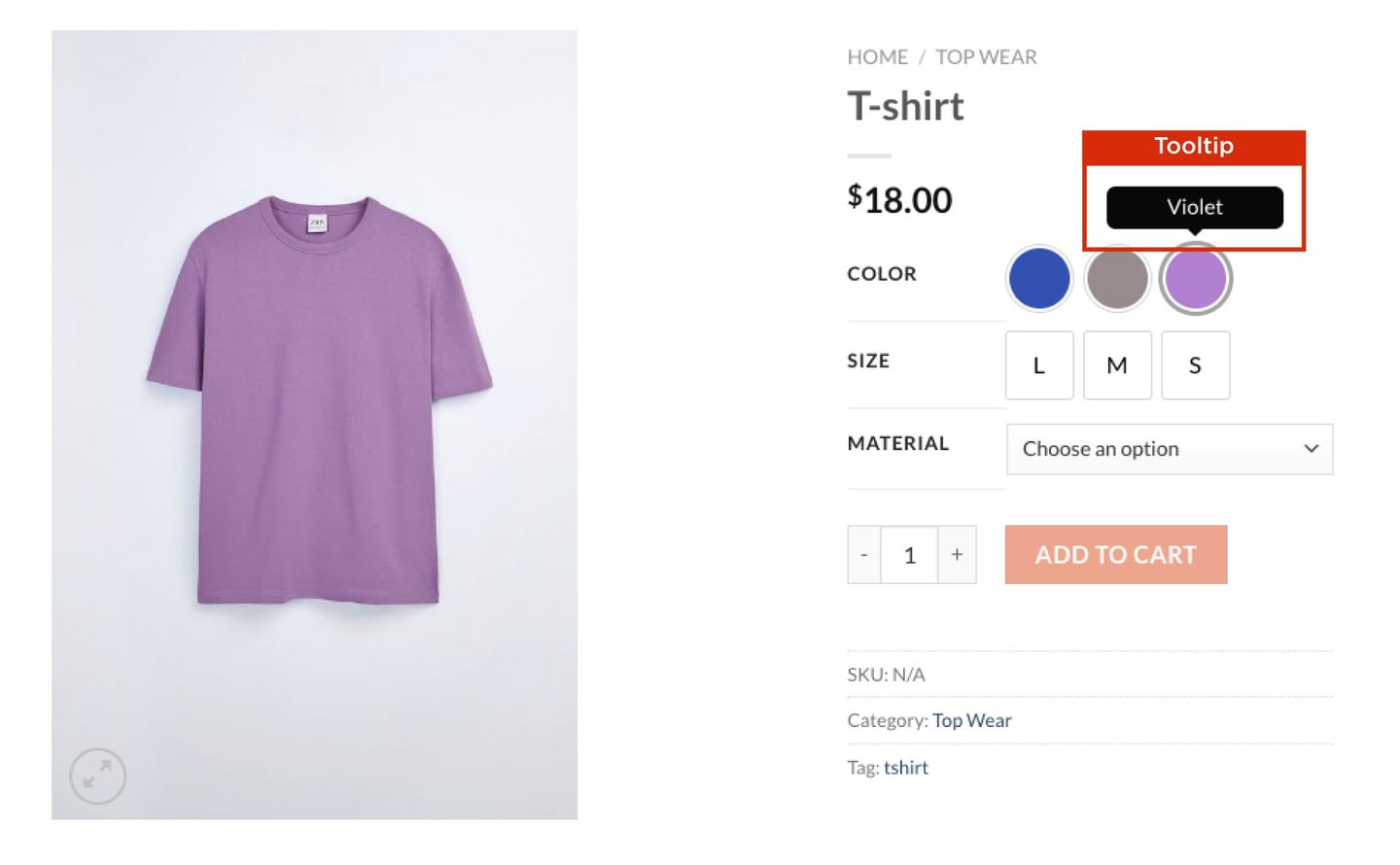
Step 5: Click on the Tooltip Styling tab and enable the tooltip option.
Step 6: Set a ‘Term Name Text Color’ and ‘Term Name Background Color’ for the tooltip.
Note: By default, the attribute term name will be displayed as a tooltip.
Backend View
Frontend View
Step 7: Finally click on the Swatch Type Specific Styling tab, to style the selection of swatches based on their type.
Step 8: Set an ‘Icon Height’(in px), ‘Icon Width’(in px), ‘Font Size’(in px), ‘Background Color’,and ‘Text Color’, for the Button/Label swatches.
Step 9: Under the Selection Style for Button/Label Swatch section, choose an option from the dropdown, this styling is only applicable for button/label swatch.
Step 10: To convert color/image swatches to dropdown, Enable Swatch DropDown option.
Backend View
Frontend View
Setup Global settings for Swatch design
Some general features that can be applied to all the swatches are available in Global settings. Let’s see which features can help you to make your product page more user-friendly.
-
Step 1: Click on the Global Settings tab from the Variation Swatches setting page.
-
Step 2: Enable the Convert all Dropdown Swatches to Label Swatches to convert the default dropdown swatch style to label swatch.
-
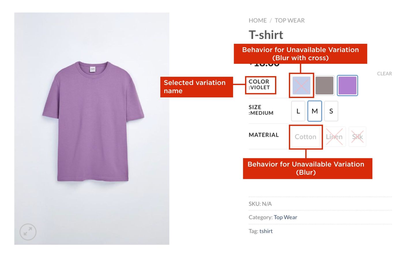
Step 3: To style the Behavior for Unavailable Variation, choose any style to display the unavailable variation from the dropdown menu.
- Hide
- Blur
- Blur with Cross
-
Step 4: To style the Behavior for Out of Stock Variation, choose any style to display the out-of-stock variation from the dropdown menu.
- Default
- Blur
- Blur with Cross
-
Step 5: Enable the Clear On Reselect feature to clear the selection of attribute terms you made on the product page.
-
Step 6: To apply the theme default stylesheet enable the Disable Swatches Plugin Stylesheet option.
-
Step 7: To display the name of the selected variation enables the Show Selected Variation Name Beside Attribute Label.
-
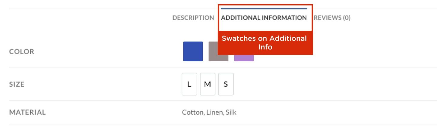
Step 8: To display the variation swatches on the ‘Additional info’ tab enable the Enable Swatches on Additional Info option.
-
Step 9: By default, the Ajax Variation Threshold value will be 30 (the value can be changed).
-
Step 10: To reduce the page loading time you can enable the Enable Lazy Load option.
If you don’t want to spend time customizing each swatch and creating designs for them, you can easily convert every default dropdown swatch to a label swatch by enabling this feature.
Backend View
Additional info
If the number of product variations is less than 30(or the value you entered), the product availability is checked using Javascript. The product availability is checked by ajax if the product variation exceeds 30 (or the value you entered).
In this way, all content on your product page except the swatches will be displayed first, thereby improving the page’s performance.
Frontend View
You are now ready to set up your store with variable products and style them with Variation Swatches.