 Getting Started
 Advanced Settings
 FAQ
FAQ Compatible Plugin & Themes
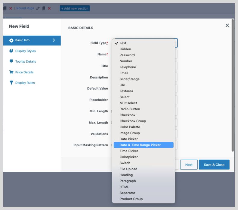
Enhance your store’s product page by adding in Extra Product Fields rather than default fields. You can now add over 24+ field types to your product page like:
- TEXT
- HIDDEN
- PASSWORD
- NUMBER
- TELEPHONE
- URL
- SLIDER/RANGE
- TEXT AREA
- MULTI-SELECT
- SELECT
- RADIO
- CHECKBOX
- CHECKBOX GROUP
- COLOUR PALETTE
- IMAGE PICKER
- DATE PICKER
- DATE &TIME RANGE PICKER
- TIME PICKER
- COLOUR PICKER
- FILE UPLOAD
- HEADING
- PARAGRAPH
- HTML
- SEPARATOR FIELD
- SWITCH FIELD
- PRODUCT GROUP
How to Add New Field to your Product Page?
To add a new field:
- Navigate to WooCommerce → Extra Product Option → Product Options.
- Click on the Add field button.
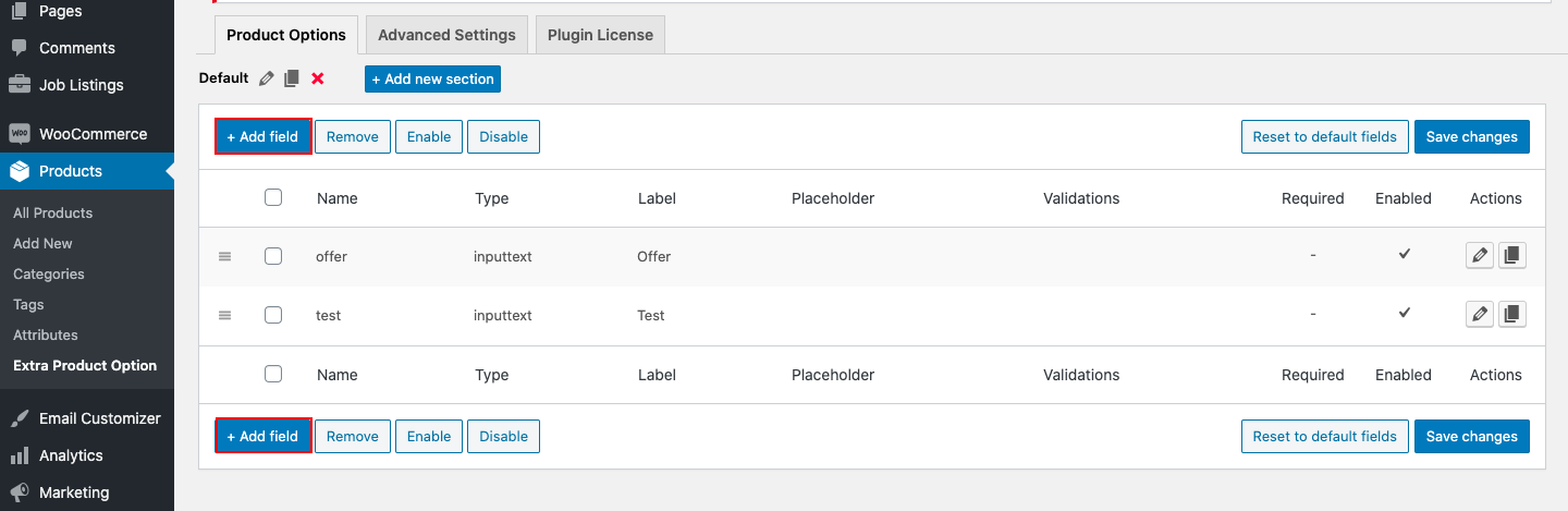
- Enter a Name, Field Type, Title, and other details of your field.
- Set display styles from the Display Styles tab if required.
- Set display rules from the Display Rules tab if required.
- Save the Field.
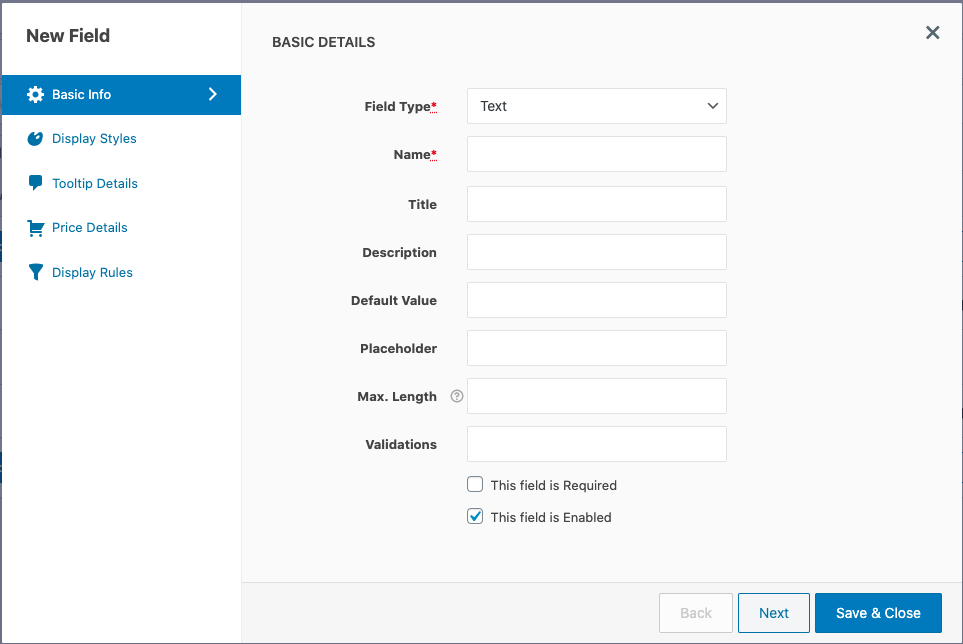
General Settings
This tab contains fields to capture all the basic details of the product field. All the properties available in the General Properties tab are listed below. Depending on the field type selected, the properties of the field may change.
| Name | Unique name for the field. No two fields can have the same name. |
| Field Type | The type for the field. It could be text, password, text area, select, checkbox, radio, email, URL, etc. |
| Title | The display title for the field. |
| Description | Description for the field. It is displayed below the title label. |
| Default Value | You can assign a default value for the field. This value will be shown as the default value when the page is loaded. |
| Placeholder | The placeholder property is a short hint (a sample value or a short description of the expected format) that describes the expected value of an input field. For example, for an email field, the expected format name@example.com can be displayed. |
| Max. Length | The max length property specifies the maximum number of characters allowed in the input field. |
| Min. Length | The min length property specifies the minimum number of characters allowed in the input field. |
| Min. Value | It specifies the minimum value allowed in the input field. |
| Max. Value | It specifies the maximum value allowed in the input field. |
| Validations | Choose validation rules that should be applied to the input field. You can define your own validation rules in the Advanced Settings section. |
| Input Masking Pattern | To specify a predefined format for the input field. |
| This field is Required | If checked, the field will be set as a mandatory field. |
| This field is Enabled | Uncheck this checkbox to disable this field. |
Properties specific to the field types Select, Multiselect, Radio, and Checkbox Group.
| Options | |
| Option Value | Option value is the value set for the options which will be saved in the database. |
| Option Text | Display label for the option. |
| Price | The extra price added for the option. |
| Price Type | The type of price added to the option. |
| Min. Selections | It specifies the minimum number of options to be selected. |
| Max. Selections | It specifies the maximum number of options to be selected. |
Properties are specific to the field types Slider/Range.
| Min. Value | It specifies the minimum value allowed in the input field. |
| Max. Value | It specifies the maximum value allowed in the input field. |
| Step Value | It specifies each numerical interval |
Properties specific to the field type Color Palette and Image Group.
| Min. Selections | Enter the minimum number of pallets/images to be selected. |
| Max. Selections | Enter the maximum number of pallets/images to be selected. |
| Allow multiple selections | Select the checkbox for letting the shoppers choose multiple options. |
| Option Value | Option key |
| Option Text | Enter the label to be displayed for the option. |
| Color Picker (for color Pallet) | From the color box, choose a suitable color for the corresponding option. You can even use the color picker tool to pick a color outside the box. |
| Image Upload (for image group) | Click on the image upload icon to upload an image for the corresponding option. |
| Price | Enter the extra price added for the option. |
| Price Type | Choose a specific price type for the option. |
Properties specific to the field type Multiselect
| Maximum Selections | The maximum number of options that can be selected from the multi-select field. |
Properties specific to the field type Datepicker
| Date Format | Define the date format accepted for this field. The default format is dd/mm/yy. These are the other general time formats you can use: International – mm/dd/yy Medium – d MM, y ISO 8601 – yyyy-mm-dd Short – d M, y Full – DD, d MM, yy With Text – ‘Day’ d ‘of’ MM ‘in the year’ yy |
| Default Date | Set default date to be displayed in the specified Date Format property. You may also specify the number of days to be offset from today (e.g. +7) or a string of values and periods (‘y’ for years, ‘m’ for months, ‘w’ for weeks, ‘d’ for days, e.g. ‘+1m +7d’), or leave empty if you don’t want to set a minimum limit. |
| Min. Date | The date picker calendar will only show dates starting from the date set in this field. You may also specify the number of days to be offset from today (e.g. -7) or a string of values and periods (‘y’ for years, ‘m’ for months, ‘w’ for weeks, ‘d’ for days, e.g. ‘-1m -7d’), or leave empty for today. |
| Max. Date | The calendar will only show dates up to the date set in this field. You may also specify the number of days from today (e.g. +7) or a string of values and periods (‘y’ for years, ‘m’ for months, ‘w’ for weeks, ‘d’ for days, e.g. ‘+1m +7d’), or leave empty if you don’t want to set a maximum limit. |
| Year Range | This defines the range of years displayed in the year drop-down of the date picker calendar. The format is “from year: to year”. You can set the range in different ways as explained below: Relative to current year (‘-nn:+nn’): e.g. -5:+3 . If the current year is 2016, the dropdown will show years from 2011 till 2019. Relative to the currently selected year(‘c-nn:c+nn’): e.g. c-5:c+3. If the year of the selected date is 2017, the dropdown will show years from 2012 till 2020. Absolute values(‘nnnn:nnnn’): e.g. 1900:2018. The dropdown will show years from 1900 till 2018. Combinations of above formats (‘nnnn:+nn’,’-nn:c+nn’,etc.. ): e.g. 2012:+3. The dropdown will show years from 2012 till 2019 if the current year is 2016. Note that this option only affects what appears in the year drop-down on the calendar popup. To restrict which dates may be selected from the calendar, use Min. Date and/or Max. Date properties. |
| Number Of Months | The number of months to show at once on the date picker calendar. |
| Disabled Days | Select the days of the week that need to be disabled on the calendar. For example, you may want to disable Saturdays and Sundays on the calendar. |
| Disabled Dates | Enter dates that need to be disabled on the calendar in yyyy-mm-dd format separated by commas for multiple dates. This is useful if you want to disable specific days such as holidays. Eg: If you want to disable 17th January 2017 and 23rd March 2017 in the date picker you can fill this field with the value 2017-01-17,2017-03-23. |
|
Readonly
|
If checked, the shoppers cannot edit the input data from the textbox. Instead they can choose the date from the corresponding datepicker.
|
Properties specific to the field type Timepicker
| Min. Time: | The starting time in the list. ex: 9:00 AM. |
| Max. Time: | The end time available in the list. ex: 7:00pm. |
| Time Step: | The interval splits the time between the starting and ending time. In minutes, ex: 30. |
| Time Format: | Choose between a 12 hour or 24 hours format. |
Properties specific to the field type Date & Time Range Picker
| Date Format | Define the date format accepted for this field. The default format is dd/mm/yyyy. If you are enabling time range picker, use the ‘hh:mm A’ format. Eg: ‘DD/MM/YYYY hh:mm A’. |
| Enable Time Picker | Click on the checkbox to enable the time range picker. |
| End Date | Provide the end date for the time range picker in the format you have configured the date. |
| Max. Date | The calendar will only show dates up to the date set in this field. |
| Max. Year | Enter the maximum year that can be selected. |
| Min. Date | The date picker calendar will only show dates starting from the date set in this field. |
| Min. Year | Enter the minimum year to be selected. |
| Show Time Picker Only | Enable the checkbox if you only need to display the time range picker. |
| Start Date | Provide the start date for the time range picker in the format you have configured the date. |
Properties specific to the field type File Upload
| Max. size (in MB) | The maximum size for the file that can be uploaded. |
| Accepted File Types | Extensions/formats for the file types that can be uploaded. Multiple formats can be inputted separated by commas. |
| Min. Files | To specify the minimum number of files to be uploaded. |
| Max. Files | To specify the maximum number of files to be uploaded. |
Here, the customer gets a preview of the uploaded list on the product page. So, they can verify the uploaded files and remove the unwanted files from the preview option itself.
Properties specific to the field types Heading and Label
| Title | The display text (content) for the title tag. |
| Title Type | The type of title element. Ex. H1, H2, etc. |
| Title Color | The color of the title text. |
| Title Class | A comma-separated list of CSS classes for the title tag. |
| Description | The display text (content) for the subtitle tag. |
| Subtitle Type | The type of subtitle element. Ex. H1, H2, etc. |
| Subtitle Color | The color of the subtitle text. |
| Subtitle Class | A comma-separated list of CSS classes for the subtitle tag. |
Properties specific to the Product Group
| Title | Enter a title for the section |
| Description | Basic information for the title |
| Allow Multiple Selection | By selecting “ Allow Multiple Selection” the customer can select multiple products associated with the primary product. |
| Independent of Base Product Quantity | Once the “Independent of Base Product Quantity” is enabled, the product chosen from the product group will be independent of the inventory product quantity. |
| Product ID | Enter the Product ID of the product that needs to be listed. |
| Label | Label for the specific option (user-defined label or product name) |
| Price | The value will depend on the price type |
| Price type |
|
Properties specific to the field type HTML
| HTML | Add custom HTML to your product page. |
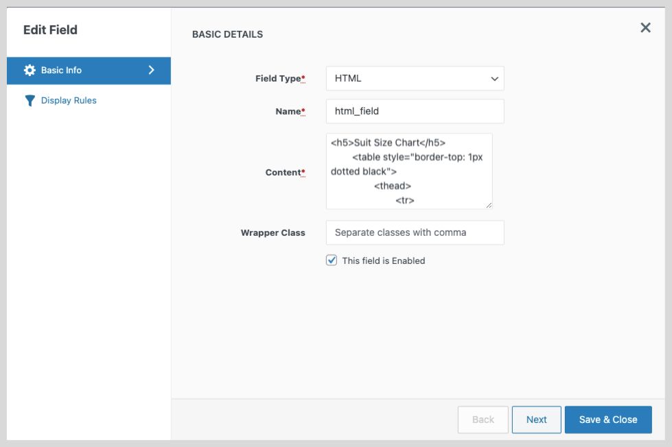
<h5>Suit Size Chart</h5>
<table style=\"border-top: 1px dotted black\">
  <thead>
    <tr>
      <th>Chest Size</th>
      <th>Waist Size</th>
      <th>Suit Size</th>
    </tr>
  </thead>
  <tbody>
    <tr>
      <td>34</td>
      <td>28</td>
      <td>XS</td>
    </tr>
    <tr>
      <td>36</td>
      <td>30</td>
      <td>S</td>
    </tr>
    <tr>
      <td>38</td>
      <td>32</td>
      <td>M</td>
    </tr>
    <tr>
      <td>40</td>
      <td>34</td>
      <td>L</td>
    </tr>
    <tr>
      <td>42</td>
      <td>36</td>
      <td>XL</td>
    </tr>
    <tr>
      <td>44</td>
      <td>38</td>
      <td>XXL</td>
    </tr>
    <tr>
      <td>46</td>
      <td>40</td>
      <td>XXXL</td>
    </tr>
  </tbody>
</table>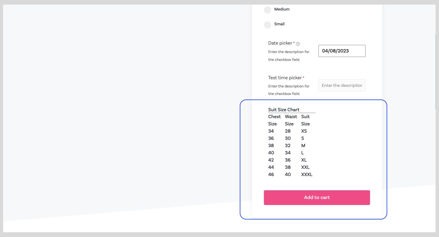
Properties specific to the field type Separator
| Wrapper Class | A comma-separated list of CSS classes that will be added to the container that wraps the input field and the label. |
| Height | The thickness of the separator can be selected |
| Separator Type | Options of 4 different types of separator – solid, dotted, dashed, none are displayed |
Properties specific to the field type Switch
| Value | Specify the value or info that you collect through this field |
Display Rules
Set display conditions from this tab. Read the article Display Rules to know more about display rules and their configuration.
Edit Fields
You can change the properties of any field including default fields. To edit a field:
- Navigate to the WooCommerce → Extra Product Options → Extra Product Fields page.
- Click on the pencil icon near the field you want to edit.
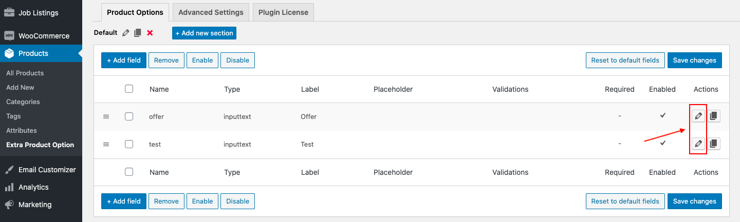
- A popup form will be displayed, you can edit any field property from this form.
- Once done with the edit, click on the Save button to save the changes.
Delete fields
Once a field is deleted it cannot be restored. To delete a field:
- Navigate to the WooCommerce → Extra Product Option → Extra Product Fields page.
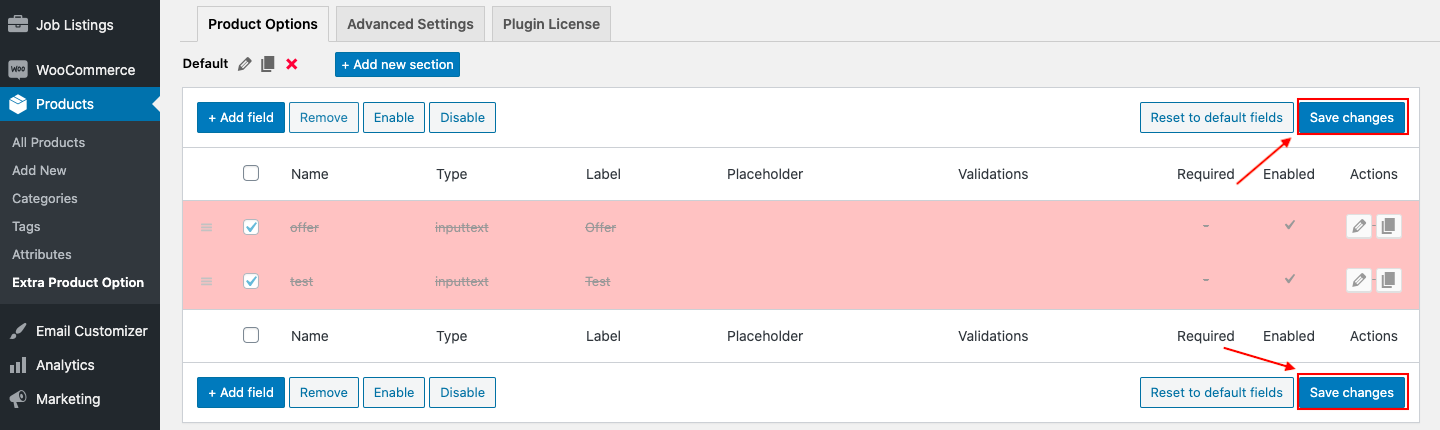
- Select the fields you want to delete using the check-boxes on the left side of each field.
- Click on the Remove button from the action bar.
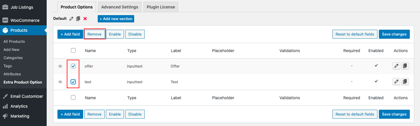
- The deleted fields will be highlighted with a red color background.
- Click on the Save changes button to confirm the delete.
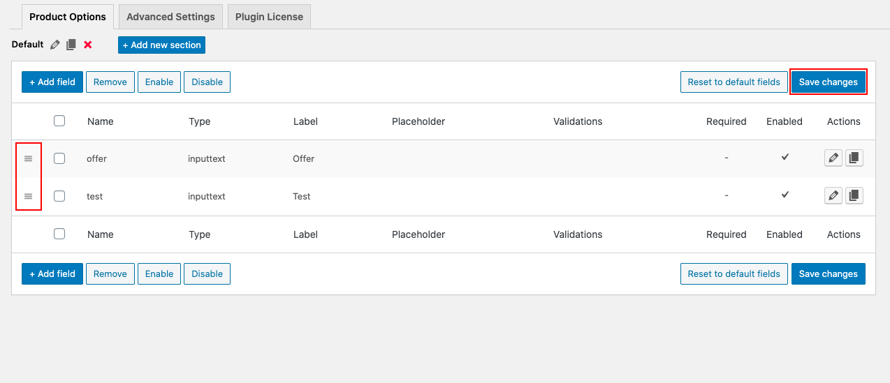
Rearranging fields
To rearrange fields:
- Navigate to the WooCommerce → Extra Product Option → Extra Product Fields page.
- Move the field up or down using the move handle at the leftmost side of each field.
- Once fields are rearranged, click on the Save changes button to save the changes.
Copy a field (Duplicate field)
This option provides you with an easy way to create a new field by duplicating an existing field. This is helpful when you want to create a new field that is almost similar to an existing one. To duplicate a field:
- Navigate to the WooCommerce → Extra Product Option → Extra Product Fields page.
- Click on the copy icon near the field you want to duplicate.
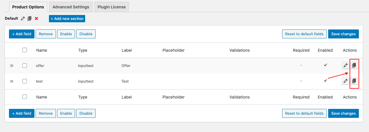
- A popup to create a new field will appear with all the property except the field name, filled the same as that of the duplicated field.
- Enter the new field name, then click on the Save changes button to save the changes.